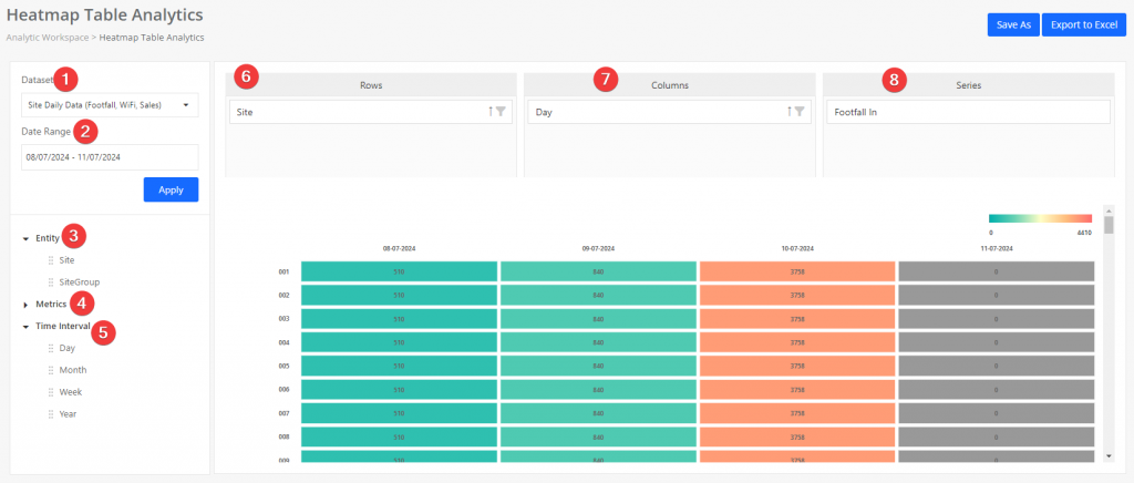
Heatmap table widget allows data analysts to have deep insights into analytics data according to the colour trend. It is easy to use by drag-n-drop fields to the Rows, Columns and Series section. It is useful to visualise large amount of multi-dimensional data.
As reference, the heatmap table widget comes with default settings to display the data, which selects entity as row, time interval as column and Footfall In as series.
Introduction

[1] Dataset
Dataset is the set of basic data available for data analysis and groups with different use cases. To know more please refer to here.
[2] Date Range
Data analysts are able to select the desired date range to set the available data for the heatmap table. After the data set and date range are selected, click apply button to obtain the available entities, metrics and time intervals.
[3] Entity
The available granularity of the entity will be dependent on the dataset selected.
For site level dataset, the available granularity are site and site group. It allows us to group the data by store level (site) or regional level (site group). To setup regional grouping, kindly refer here.
For area level dataset, the available granularity are area and area group. It also allows us to group by area or area group. To understand more regarding area and area group, kindly refer here.
Entity is applicable to rows and columns but not applicable for series.
[4] Metric
The metric available will be dependent on the dataset selected. Kindly refer here for the full list of datasets available.
Metric is applicable to series only.
[5] Time Interval
The available time interval will be dependent on the dataset selected.
For hourly dataset, the available time interval are hour, day and week, with hour as the smallest time interval. For daily dataset, the available time interval are day, week and month, with day as the smallest time interval.
It is applicable to rows and columns.
[6] Rows
Represents the row in the heatmap table. Only one entity or time interval is applicable for rows.
[7] Columns
Represents the column in the heatmap table. Only one entity or time interval is applicable for columns.
[8] Series
Represent the value of the table, aggregated based on the rows and columns item selected and view.
Heatmap Table comes with simple drag and drop interaction to generate the view you wish.
Restriction
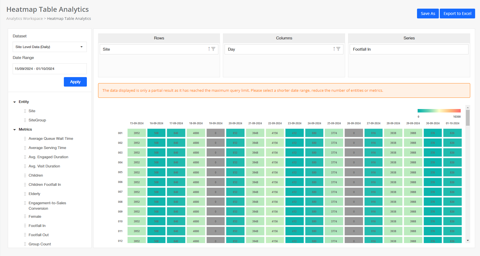
To ensure optimal performance and prevent data processing delays, the Heatmap Table widget has a maximum query limit of 50,000 records.
Important Information:
- Partial Results: When the maximum query limit is reached, the data displayed will only be a partial result set. This means that the heatmap table may not show all possible data points for the selected query.
- Recommendation: To obtain complete and accurate data, please adjust your query parameters by:
- Selecting a shorter date range.
- Reducing the number of entities.
- Limiting the metrics included in the query.


